Someone asked me the other day what the heck you’d use split toning for.
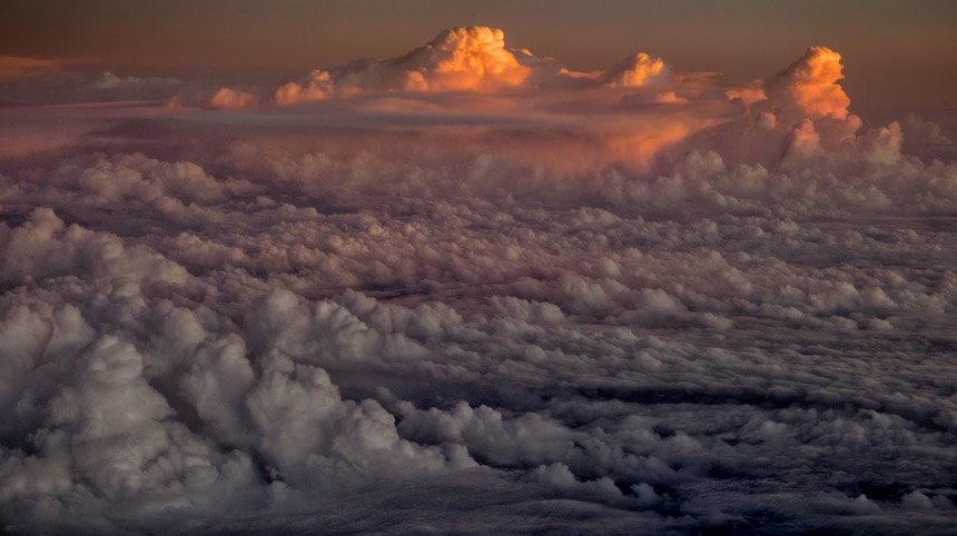
Consider the above image. If you look carefully you’ll see three predominant white balances from the lower left corner up into the upper portions of the image: roughly slightly blue-magenta, clearly magenta, and sunset orange.
Most people don’t realize that areas in shadow versus sunlight have different proportions of the colors of light. Shadows are “cooler” (more towards blue/magenta) while open sunlight is “warmer” (more towards red/yellow). If you had a team in uniform half in shadow half out, you might want to do something about color balance so that the uniforms and skin colors look right, and that’s where things like split toning tools can help you.
Here, I’ve simply allowed the colors to tell the story of the waning sun. But when you have opposite colors you want to impact, the split toning tool works well to adjust those differently-colored areas towards each other (needs to be subtle).
Personally, I tend to use the HSL tool with layer masks to do this kind of work, as it gives me more flexibility, but if it’s a small, simple move you need, sometimes the split toning tool can provide most of what you want.